In this blog I have kept all of my technical development work for my animations over the past year. I have also provided analysis of the technical aspects to my animations on here. There are also other things such as visual and concept development, but the purpose of this is to be able to show you my tests in an easier way. Please use the navigation I have provided down the left side to look at different projects. The blog is quite long so this might help.
The problem with animation is that everybody outside of our world only see our months of hard work as a few seconds of footage. It is very easy to overlook the techniques that are required in order to make animation work. There are no specific animation tutors at the university, so I have taught these techniques to myself. I am going to write this as a general overview of my year rather than target it at specific projects, because that would be a little irrelevant to the projects themselves.
These are the main things I have learned and tried to master this year:
Key Frames
Key frames are perhaps the most important idea one has to keep in mind when animating. They are basically points in which an action starts or ends etc. Key frames are an extension of the storyboard. I have found them invaluable for my two most recent projects. In the past I have just animated in a straight line, but using keyframes I can make more informed decisions about where my movements are going. Just as important are the ‘Extremes’. These are the points between main keyframes. So the idea is to animate with at least a start, middle and finish ready. It is no good animating in one long line.
(Source if info: Richard Williams – Animator’s Survival Kit, book)
Timing
If you don’t time things in animation you will end up with something that moves…. but it will look dodgy and unnatural. Timing and spacing (between frames) is the key to a good quality animation. Ideally you should keep a stop watch with you and time actions that you intend to animate. Timing also controls perceptions of weight, force and resistance.
I used timing in my butterfly animation for Town under City to give it a light and dream like quality. I did this by speeding up the straight lines it flew in and slowing the corners right down (this was done simple by distance of drawing). If I had animated this without timing it I would have ended up with a rather dull movement. If you look at the image above closely you will see where I have increased or decreased the spaces to affect the weight and speed.
(Source of info: Tom Sito – Timing for Animation, book)
Walk Cycles
Richard Williams is often called the god of walks in animation, so I thought it was best to learn from the best. His book ‘Animator’s survival Kit’ contains lots of information on how walks are usually formed and rules that can be bent to form almost any kind of walk.
A lot goes on in walks, which is why in Town under City, the most difficult scene to get right was a simple walk cycle scene. It is because as humans we are more critical of the way a represented human being moves (than we would be of an animal). The first thing I learned was the four main keyframes:
Contact – Where the heel of the foot touches the ground.
Recoil – Where the back leg slips up.
Passing Position – Where both legs overlap.
High Point – Where the knee being brought up is at its highest point.
The directions above are only for legs. However it is always useful to remember that our arms always oppose our legs. If your left leg is out, your left arm will usually be back.
Using this info I did this very early test using only these positions in my sketchbook:
I was very pleased with it, even though it was still extremely basic.
(Source of info: Richard Williams – The Animator’s Survival Kit book)
Reading and writing Dope Sheets
A dope sheet is essentially a list of every single frame in the animation with detailed instructions on what the timing should be, what the action is, where the camera will be etc. For big productions they are essential, however I wanted to learn how to use one so did this for my animation ‘Void’.
The first page of my dopesheet for 'Void'
It allowed me to plan out every detail carefully and made me a lot more organised about what needed to be done. However I found them a slight hinderance as they can be restricting. For instance if you want to extend the timing of a scene you feel in many ways guilty about it because the rest of your chart will fall out of place.
I am glad I know how to use and read a dope sheet, except I don’t think I would use one again for a personal project.
(Source of info: Richard Williams – The Animator’s Survival Kit book; Tom Sito – Timing for Animation, book)
Timing Charts
If you have watched any of my line tests, you will probably see flashes of little charts in the corners of some of my key drawings. These are timing and spacing charts. I use them quite a lot when I animate because they are very useful when working on ‘in betweens’. Here’s an example:
What you could consider this as is a ruler with notches on it. The notches are where I have to put the next drawing. In this case we are looking at an arm movement. So from this chart I can say that I wanted his arm to move from frame 9 to a position in frame 17. I wanted it to start off slow (because the notches are closer together at the top and then speed up to the end (the notches get further away). One way of using these is to choose a point such as an elbow or hand. Then use the chart as a ruler to measure the that particular part of the body next has to be. Unlike Dope Sheets, I find these very useful.
(Source of info: Richard Williams – The Animator’s Survival Kit; Tom Sito – Timing for Animation, book)
Squash and Stretch
I am not really a big fan of bouncy, stupid characters, but this concept is actually still useful. I have used it in things like my bird breaking the man out of his chains in Town under City. The idea is that weight can be implied through subtle deformations in the shape of an object, usually for a split second. However other things like muscles etc would benefit from this concentration on mass.
(Source of info: Walt Stanchfield – Drawn to Life, book)
Anticipation
Anticipation is the theory that many actions don’t just ‘happen’. A momentum is needed for most things, some kind of counter movement or preparation. It is very subtle in real life, so we don’t tend to notice that somebody will take a step back before a run for example. In animation it is very important to understand this, otherwise moving characters will just look mechanical in their movements.
To show you how I use this in my work I will use a scene from the Vagrant:
I want you to look at the point where he lifts his hand up towards the direction he started looking in. Just before he does this, he first draws his arm backwards for momentum. It is very subtle, but makes a real impact on the natural flow of movement.
I use it everywhere I can, for example somebody doesn’t just get picked up by a butterfly without warning. To give the viewer time to catch up with the narrative I had to make the character respond to something off screen and allow him time to bend to his knees in an attempt to avoid being grabbed. This way, the viewer knows what is going on before it actually happens.
(Source of info: Walt Stanchfield – Drawn to Life, book)
Follow Through and Overlap
This is a very important concept that I am still trying to master. Essentially, it makes objects appear to follow the laws of physics. Look back at my Vagrant scene above. In this scene I had the blanket, which is drapery. Drapery wouldn’t move directly with the arm as the clothes might. It would ‘drag’ behind and overlap (when the character starts going in one direction and the drapery for example would continue in the opposite direction). This was another thing that contributed to this scene being quite strong in terms of movement.
(Source of Info: Richard Williams – The Animator’s Survival Kit, book)
Slow in and Slow out
This is a very simple concept that the body will not usually make a movement in one constant speed. It has been found that it will often go slow at the start of a movement and slow at the end in natural circumstances. Playing with this can produce interesting results such as shock (kind of like my Vagrant scene above does at the very start where he hears something and looks up).
(Source of Info: Richard Williams – The Animator’s Survival Kit, book)
Arcs
The main error I made with my first animation this year (Void) was that many things would move in straight lines. In nature nothing moves in a straight line. It always follows an arc of some sort. I found this interesting and have considered for all of my animations since.
(Source of info: Walt Stanchfield – Drawn to Life, book)
Other Sources
These are the main things I learned from my own independent research. There are other things I have looked up like how to make a lightbox – which I did in December! I’ve been making my animations on it since. There’s the debate about whether to use top or bottom pegs etc… but the points above have had the biggest effect on my work. Here are some of the other sources I have used a lot throughout this year:
Tony White – How to make Animated Films (book)
Burne Hogarth – Dynamic Anatomy (book)
Paul Wells – Understanding Animation (book)
Richard Williams – The Animator’s Survival Kit Seminars (DVD)
When it came to colouring the vagrant character in our collaborative film, I was the first to do it. Therefore I ended up choosing his colour scheme in the final film. Here’s how I coloured him:
I knew that I needed a subdued colour, with possibly an influence from the sandstone buildings around him. The sepia tone also adds the age required to the animation. However this first version (above) was a little too bland. I needed to make the colours stronger.
Instead I opted for these three colours. It gave a very striking lighting system and also sped up the production, as 3 colours are better than 7!
To colour the vagrant I put the original scanned drawing into Photoshop, keyed out the white colour and placed a layer underneath it to paint on. This way the black lines remained.
Because the vagrant moves slowly I was able to select his outline and flood the area with a base colour, whis was very helpful.
I then arranged the flooded colour layer behind the line drawing.
Finally, I carried on shading with the remaining two colour swatches. Overall I am very pleased with the result and think it works very well. The colour scheme is so striking that it resolved some problems with inconsistencies in other people’s drawings of the same character.
The most time consuming animation of all was also the shortest – my walk cycle.
The trouble is it deviated from everything I had learned about. I have been using Richard Williams’ book ‘The Animators Survival Kit’ to learn how to create most walk cycles. However mine was a limp, so each foot had a completely different weight and timing. It took a lot of trial and error, so after the first few goes I figured it our with a ‘wireframe’ animation. In that it was very basic lines and circles, which I could then draw the character over when I found a successful one.
This was my first attempt at any walk cycle (it happened to be for this project):
I was unhappy with this because it was too cartoony and didn’t show the full body.
This was the first time I animated the character design I had. Unfortunately I accidentally animated this at 30 frames per second instead of 12. This resulted in a lot of wasted time and an animation that is too wobbly. I also learned (at the end of this clip) that moving/ static noise backgrounds do not work.
This was the third time I tried it. As you can see I have started using wireframes at this point. I changed the timing so that his limping foot was slightly faster than his other (the natural timing of a classic limp). I was somewhat happy with this, but it seemed a bit too bland. I wanted more expression in the movement.
Here is a forth version with slightly more expression. This time he also collapses to his side. I was unhappy with this movement because it was a little TOO expressive and didn’t look natural.
This was the fifth version of the walk cycle. It was getting there, but there was a bizarre bouncing in his left arm. It looked kind of ridiculous so I had to do another one to get rid of it.
This is the sixth and final version of the walk. I was very happy with this and confident that it was exactly how I intended it to be. The walk you see in the final film was built on top of this original wireframe.
Luckily this was the only major technical problem with my entire animation. After my last animation ‘Void’ I promised myself that I would plan my 2D animations better so that I would not need thousands of masks to place each drawing on to the background. Well unfortunately I didn’t see this problem coming. I had an animation that required both a foreground an background. The trouble with this is that parts of it overlapped and so appeared in the wrong place (see below):
The wings in this scene had to appear behind the door and the chains had to be infront of it. The whole animation was drawn combined so this was going to be a long night…..
I first tried masking alone, but this was impractical and would have set me back considerably.
I then tried greenscreening the whole layer and keying out all of the colours I didn’t want (like the red wings). This was quite ineffective.
In the end, the fastest way for me to do this was to go back into photoshop and manually edit out each of the problem frames. This took a long time, but was far less destructive than the other methods.
There was still some masking to do however and sometimes it got very complicated. Every time you apply a mask you have to disable it on the next frame (which is why it looks like a complete mess in this screengrab). It works though and thats the main thing.
After the colouring phase was over, I was tasked with the job of sequencing all of the newly coloured frames. Its actually a lot trickier than it sounds. First of all, for each scene – photoshop could only ever handle 20 frames at once (they are HD quality images). Therefore I had to stitch together a big range of different ‘segments’ for each scene. After this I would have to manually move each frame into a sequence on the timeline. This took a very long time – here is a screenshot of me in the middle of it:
The separated segments (all obtained from the photoshop files I created earlier)
Moving each photoshop ‘layer’ into a sequence on the timeline in After Effects
After this was done I had to actually composite the file to make it look more polished. This usually results in hundreds of adjustment layers (for things like brightness change, mist, rain… anything really), colour layers, 3D lights and virtual cameras. Here is a screengrab from one of my busiest scenes in the thick of it:
For some very small background animation I sometimes used a program called Toon Boom. It allows me to work in the same way as I do over a real lightbox, except it is a computer program so allows greater speed. However I wouldn’t use it exclusively as the effect is still kind of computerized:
Many of the animations for Town under City required the character to turn convincingly in imaginary 3D space. To a certain extent, I can do this unaided – however to make things more consistent I decided to make a clay model of the character’s head to help me out:
Colouring was a very long and drawn out process. It involved scanning in every frame (around 600 or so) and then manually painting them in photoshop. Here is how it was done:
I’d take a black and white line drawing (my frames) and ‘key out’ the colour white using the Photoshop. This allowed the background to show through the frame.
This is an image of what this leads to in terms of file structure. I took the original frames, put them into individual folders and then keyed out their white. Then I added a layer underneath this which was coloured (alowing the black lines to remain untouched). Each folder then represents one frame. I could then take these into after effects to sequence them. Its a long process, but through experimentation I have found that this works best and gives the best quality I could hope for.
I created a ‘custom brush’ in Photoshop and used a drawing tablet to paint the actual character. I designed the brush so that it would represent my painted concept art as closely as possible. The colour was added to my character in four stages. Using defined swatches (based on my concept art) I painted a base over the whole character so that he was no longer invisible. Then I added highlights, then shadow, then deep shadows. Each frame took around 5 to 10 minutes to paint in this animation. A large amount of time when you consider there are over 600 frames of it!
This is an example of how well my custom brush matched the effect I was getting with real paint in my concept images:
These are the animations I did for the Vagrant film that Hayley, Will, Ben and I worked on this year.
The Closeup Shot
This was the finished closeup shot that was used extensively through the piece. I thought this was very strong in terms of character emotional animation so I was very happy with it. The sequence spans 58 drawings.
This was the same scene before I coloured it.
This is the ‘rough’ animated closeup.
Begging Scenes
This was the finished version of my tramp begging. I think that it is very strong in terms of character movement and drapery animation (which I have never tried before). A lot of time has gone into this so I am very happy that it was worth it.
This is the same scene after the cleanup process (I also added drapery and clothing in this process).
This was the rough animation of the above shot, but also with an extra shot at the end. This extra shot had to be cut because of a hand injury I had. As you can see, it is fully animated but requires cleanup and colouring.
This was a very early draft of the same animation. I was unhappy with both the movement and style of behavior. The tramp would not stretch out all that way because he is too cold. The movement and figure drawing is also dodgy. I was much happier with the later version (above).
Street Walk Cycle
We all did a walk cycle and this was mine. I decided to do it with detailed movement so it is 24 drawings long. The reason it is black is because it had been planned for the people in the street to be silhouettes.
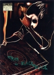
Stemming from my interest with expressionism comes a more contemporary influence, Dave McKean. I came across his work via the book covers he made for ‘The Sandman’ Graphic Novels by Neil Gaiman. I love his style and it continues to inspire me.